Buying a flight these days can be confusing, to say the least. There are lots of places selling the same flights; different airlines use different terminology to describe similar products; and complicated low-cost models – where every aspect of the flight experience, from check-in to onboard dining – is individually priced and presented as ‘options’ (even though, for most passengers, they’re ‘necessities’). The internet radically has changed the experience of searching for and booking a flight, sometimes not in a good way. What should be quick and easy, even pleasurable, can be difficult and labour intensive. And, at the end of the process, you might feel you didn’t quite get the amazing deal you thought you were.
It’s a problem we grapple with all of the time at Netflights – how can we make finding and buying a flight as simple, intuitive and transparent as possible, while also ensuring customers get the best value?
For us, buying a flight is like buying tortillas. We love tortillas here at Netflights. There’s something about putting together all your favourite ingredients that’s just so satisfying. But here’s a thought. Imagine reaching a supermarket check-out with two tortilla kits – made by different brands, but on the box essentially the same – which are fractionally different in price. You’re able to scan one without a problem, but when you attempt to scan the second the self-service till beeps and tells you that, actually, if you want the salsa, you have to pay extra. ‘I can’t have a tortilla without salsa’ you think – so you tap ‘yes’ and try again.
The till beeps a second time: ‘If you want the flavouring, that’s extra as well.’ A tortilla without that smoky paprika tang just isn’t a tortilla, so you tap ‘yes’ and try to finish your shopping. A queue is forming and this is getting stressful, but still you can’t check out. The till beeps again, this time asking you whether you want the wraps themselves. You definitely can’t eat a tortilla without a tortilla wrap, so you wearily tap ‘yes’ and finally get the total due.
What looked like a good deal on shelf suddenly isn’t. What you thought were identical products actually aren’t. And one, which you thought was cheaper, is actually more expensive than the other – even though the product is basically the same. The ‘options’ you’ve been given aren’t really options, because without the salsa, flavouring and wrap, it won’t be a tortilla – so you have to add them in. You pay, but you can’t help but feel you’ve been a bit… misled. And when you eat the tortillas later, somehow they aren’t quite as good. You feel somewhat duped – especially since those extras weren’t clear on the shelf.
For us, there’s not a huge difference in the tortilla-buying scenario above, and that of buying a flight. For salsa, flavouring and wraps – read hand luggage, in-flight meals or seat selection – we want customers to be able to compare all of the options they have when booking a flight equally. So that when they click ‘buy’ they know they’ve got the best deal.
And we know that the better we can explain those choices, the more useful we are.
The airlines’ practice of bundling optional services that they historically charged for a la carte is called ‘Branded Fares’. These fares can include a checked bag allowance, hand baggage inclusion, onboard food, drinks and Wi-Fi – among others. But recently airlines have introduced cheaper branded fares with fewer extras included, like ‘bagless fares’. This is often the cheapest price, so it’s automatically listed at the top of your flight search and therefore looks like the best option – even though you’re getting less for your money.
In our grocery scenario above, this is the second of the two kits: where necessary elements of the overall tortilla experience appeared to be included in the shelf price, but actually had to be added in at the point of purchase. This causes a problem for customers, who are effectively asked to make a choice between two different products, which are otherwise being marketed as being the ‘same’. This leads to confusion, dissatisfaction and increased effort while they research and compare the various extras, before being able to make an informed choice.
It would be so much better if you could see all of the items included in the product you want to buy on equal terms from the start, right? So you know that the two tortilla kits – or flights – that you’re looking at are equally comparable, and don’t require a complicated analysis to make sure you’re getting the best deal possible.
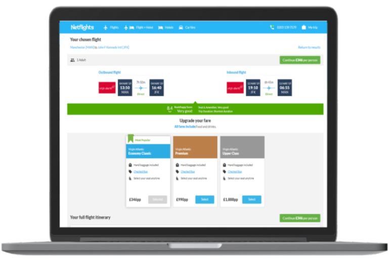
To overcome scenarios like the above, we’ve developed our technology to give you greater transparency around airline products and add-on services to the airline ticket you wish to buy.
We’ve built a simplified and intuitive website that clearly and explicitly shows the chosen fare, with the exclusions clearly shown, and what the next two best alternatives are – highlighting which is the most popular. By ensuring inclusions on base fare options are clear from the outset, we aim to help clarify what is or isn’t included, and what your upgrade options are, if you want one.
We know that, in attempting to provide greater choice to passengers, airlines have drastically complicated the process of buying a flight. Our mission is to help you to navigate that process with simple, reliable and trusted digital products wrapped in an easy-to-use website. It’s something we’ve done since 1995. And now more than 1.5 million people a year in the UK take a flight they’ve booked through our site, having searched through the thousands of routes and hundreds of deals we offer.
So, next time you are weighing up the choices of which tortilla kit – or flight seat – to buy, rest assured that by visiting Netflights we won’t surprise you at the till with extra charges for salsa, flavourings and wraps.

